Jason Hawkins 5 Conversion Optimization Ideas to Implement in Your E-Commerce Store Jason Hawkins 67 17 1 4 67 17 1 4
It’s hard to stand out these days with the population of websites on the web just over one billion. Now more than ever businesses need creative ideas on how to be different and personalized to their target audiences. Below are five creative optimization ideas to explore for your business.
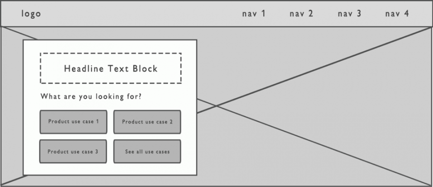
1) Develop “Use Case” Content Pages and Messaging
Most websites are good at explaining what they do. Some are good at explaining who it’s for and why they need it. Rarely do websites demonstrate content around the situations their users are in.
Let’s use an example of a website that sells guitars. What does the website do? Duh – sell and ship guitars. Who is it for? It’s for people who play guitar or people who want to gift a guitar. Why do they need it?
In order to play the music they like. How do they intend to use it? Some might want to learn guitar for the first time. What are the best guitars for beginners? Some are experts and might need it to play lead guitar in their band. How can we show them their options and remove the distractions of other guitars? Some might be average guitar players but looking for the best guitars to play a certain style (like fingerpicking) or type of music, like indie or alternative rock.
So the idea is to assess what the top use cases are for your product(s) and make it easy for users to choose their path, increase their focus and, in turn, your conversions. If you need an idea, below is an example wireframe of a homepage banner image.
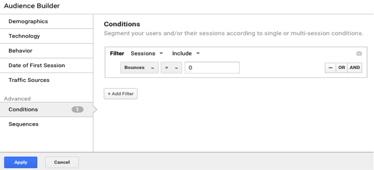
2) Use a Remarketing List that Includes Users Who Don’t Bounce
Many digital marketers understand the benefits of remarketing, especially when it involves a business with rather long sales cycles. Oftentimes businesses deploy remarketing to all visitors that hit their site but as you’re probably familiar, many of those visits bounce.
A bounce is a pretty strong indicator that you were not found relevant to that visitor, and that’s fine because you can’t please everyone. So why would you spend money to bring them back to your website?
There are plenty of users that view multiple pages or interact with your content that also don’t convert right away. The good news is this is made quite easy when Google Analytics is integrated with AdWords.
How to implement:
In the Google Analytics Admin, click Audiences and create a new audience with condition “Bounces = 0” applied. Then rename the list to be “No Bounce Sessions.” Now you can create remarketing campaigns for that list.
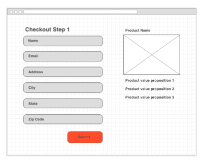
3) Use Value Proposition Reminders During the Checkout Process
When purchasing a product online (that’s not from Amazon), users typically experience the same inconvenient process of typing in their account information, billing information and shipping information. Some websites are better at it than others, but it’s safe to say people wish there was a better way.
With this already being a turnoff, any e-commerce company also deals with the audience realizing they are about to have a little less money. What if there was a reminder to reassure users why they are buying the product during the checkout process?
Think about it. When you’re at a retail store, you’re likely holding the product from the time you take it off the shelf to the cashier. But in e-commerce, you add a product to your cart and are separated from your product as you fill out your information. Weird right? That’s like trying to buy a hat at a store but in order to buy it, you need to leave the hat on the shelf and go into the manager’s office to fill out paperwork. Kind of a turn-off, huh?
How to implement:
Show this wireframe to your UX and/or development team. Ask what the level of effort would be to develop a module that added the products in a user’s cart to the sidebar during the checkout process.
4) Use a Sticky Navigation Instead of Fixed Navigation
A study by Smashing Magazine showed that 85% of participants preferred sticky navigation.
It found that 22% of participants felt it was easier to navigate. In their usability test, users saved an average of 36 seconds to find what they were looking for with sticky navigation.
Efficient navigation and browsing will often lead to increased conversion rates. Especially on mobile devices where users may spend longer time scrolling, it’s nice to make important content easily clickable. One anonymous retailer saw a significant decrease in their bounce rates and a 10% conversion rate improvement.
How to implement:
Talk to your developer team about sticky navigation. This guide shows how it can be implemented with CSS or jQuery.
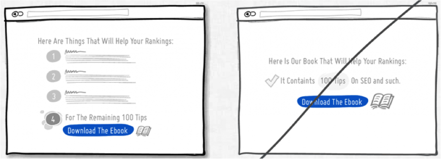
5) Increase Visitor Curiosity
GoodUI.org says, “Teasing your users, customers and/or leads with samples and hooks is a good way for people to want to continue on the path of action.” Provide a taste to an Ebook with some of the best key concepts or a headline to a video. Goodui.org reports that they have evidence of seeing a stellar 21% increase in conversions from websites using this tactic.
Do you have some awesome conversion optimization ideas? Let us know in the comments below. Happy optimizing!
Photo Images 1-3: Screenshots taken by author October, 2016. Photo Image 4: GoogleUI.org.