Dmytro Spilka Guide to Google Data Studio: Data Visualization in SEO & Digital Marketing Reporting Dmytro Spilka 91 24 4 9 91 24 4 9
When you hear the term SEO, you think of masses of data, and, for the most part, elements of SEO can produce huge amounts of data. This sounds brilliant in theory, but the information can only be beneficial if used in the right way and can be understood from the outset.
For example, any website can boast of huge numbers, but how is this incorporated by the everyday Internet user? Sure, you’ll have visitors who know exactly what you’re talking about, but the majority will probably see numbers and run in the opposite direction. This is particularly applicable when preparing performance reports for clients.
However, as the internet continues to evolve, so do the methods used behind the scenes. As such, a new way of presenting data in an aesthetically-pleasing manner is unsurprisingly gaining traction, but to instill such a method into our working practices, we first have to understand as to why it’s becoming popular.
What is Data Visualization?
If you ever remember a person standing in front of a pie chart explaining the company’s progress, you will be familiar as to how data visualization works, in that it represents information in a pictorial form. This is because, when used in the right way, a visual representation of data will be more likely to make an impact and those viewing the information are much more likely to absorb it easily.
Similarly, if you ever created a social media marketing campaign, you will be fully aware that posts that include images perform much better than those that don’t.
In fact, according to BuzzSumo, Facebook posts with images see 2.3X more engagement, whereas, according to StoneTemple, tweets with images receive up-to 9X more retweets. This in itself should show how visual the online world has become, and those of us working behind the scenes should embrace such a powerful tool with open arms.
When it comes to feeding information to users on social networks, you will find that companies and online brands are relying more on visuals to represent their data. This ensures that viewers are being given data that is easy to absorb, as well as being easy on the eye.
How is Data Visualisation Relevant in SEO & Digital Marketing?
As pointed out earlier, the world of SEO can mean that masses of data to deal with, and looking at endless numbers and stats, can cause more confusion that it unearths insight. As such, data visualization can be applied to ensure we’re able to explore the information, absorb it in a more useful manner and deliver the data to our clients in a visually-appealing way.
There are a number of tools that can be used to harness our data and present it an aesthetically-pleasing manner for a quick diagnosis. You can then use these layers to funnel information into other areas. In essence, it can effectively ensure that all cogs are turning and producing the best results for the website in question.
Later in the post, we will be exploring the new data visualization tool introduced by Google – Google Data Studio. But first, let’s look at the benefits of data visualization.
What Information Can Benefit from Data Visualization
Any SEO expert will know how much data there is to look through, so it only makes sense that we organize this data in a way that is easy to understand. As such, those dealing with the many aspects of SEO could instill data visualization.
Clearer Information for Clients
When employing the services of an SEO expert, it’s unlikely that they will want to receive an amalgamation of text and numbers in a cumbersome word document or Excel spreadsheet. Fortunately, data visualization can present this information in a way that even those not familiar with the online world will understand.
Analyze Your Own Data in More Detail
Want to see how your backlink campaign compares to that of a competitor? Or maybe you want to pin point web content that has a high bounce rate. Whatever information you’re looking for, you can be sure that it’s easy to instill new methods more quickly to ensure your website is finely tuned and fully optimized.
Experiment with Data
Data visualization adds a new layer to the information we’re able to source from a number of different funnels, and as such can be played around with and finely tuned so it reports what we need it to for a certain campaign.
Data Visualization Makes an Ideal Marketing Tool
As well as allowing for you and your clients to see data clearly, it also allows you to promote your insights to others. This can include the promotion of your website or an extensive research you carried out on social media usage.
This really outlines how important data visualization has become in the world of SEO and reporting, and how it should be adopted as part of any campaign.
Now, let’s look at how Google Data Studio can help us achieve this task.
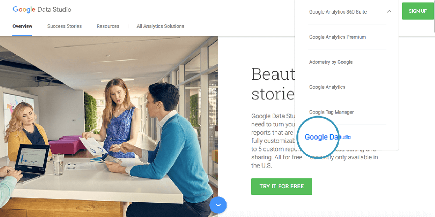
What is Google Data Studio?
Google Data Studio allows you to turn the data into branded, beautiful, informative and interactive reports by connecting and pulling the data from your client’s Google Analytics, Youtube Channel, Adwords Campaigns, Google Sheets and more. Furthermore, you can import pretty much any data using Google Sheets, whether it’s your latest Twitter Marketing Campaign or a research you did on demographics of Bengal Tigers.
When done, you can easily share the report with your clients and colleagues by entering their email address or getting a sharable link.
How to create your first Google Data Studio Report
Let’s now create our first Google Analytics Visual Report using Data Studio.
Step 1: Visit Google Data Studio & Log-in with your Google Analytics Credentials.
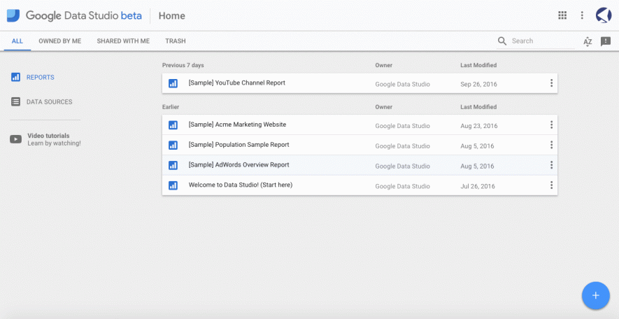
Step 2: When logged-in, you will be redirected to the following dashboard with some sample reports. Here, you can add new reports, data sources and view a step-by-step tutorial. Take your time to view some samples to get the feel of the power of this tool.
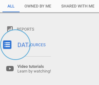
Step 3: Let’s go ahead and add a new data source by clicking on a “Data Sources” button in the upper left-hand corner.
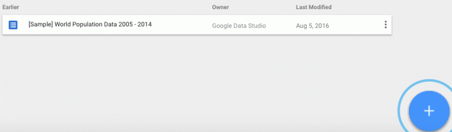
Step 4: In the data sources panel, click on the floating “Add” button to connect your Google Analytics with the Data Studio.
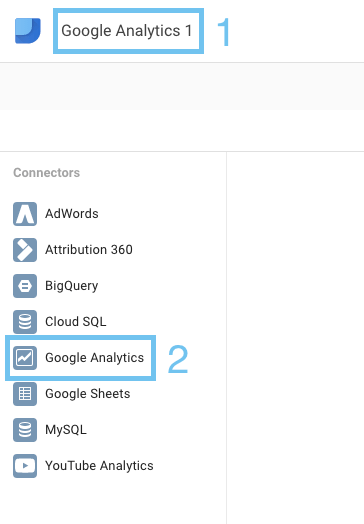
Step 5: On the next screen, add a name for your data source and choose Google Analytics from the “Connectors” list. You will then be taken through a quick authorisation process to connect the relevant Google Analytics property.
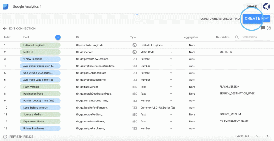
Step 6: Next, you will be taken to the list of metrics available to use in your report. You can add new formulas or disable the existing ones.
If everything is ok, click on “Create Report” in the upper right-hand corner.
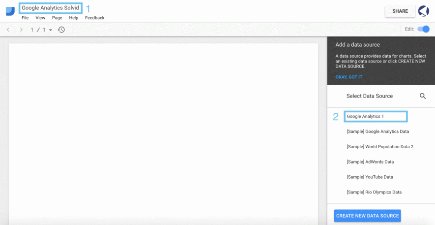
Step 7: You will then be taken to the screen where all the magic happens. Add a name to your report and select a data source we’ve just created.
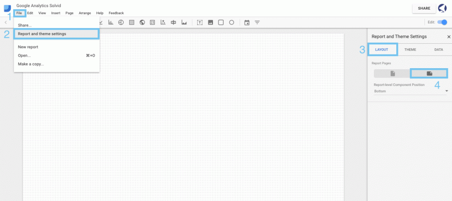
Step 8: You will then be presented with a canvas where you can add elements, text and styles to use in your report. But first, let’s change the page orientation to Landscape by going to “File” > “Report and theme Settings” > “Layout” > “Landscape”
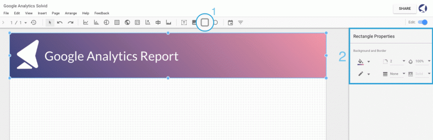
Step 9: Let’s now add some style & branding to our report. We’ll start with a rectangle tool to draw the header area. You can then add custom colors, import your logo by clicking on the image tab, and add a heading using the text tool.
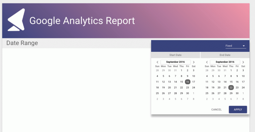
Step 10: Let’s now proceed with adding the actual visual data. We’ll start off by adding an interactive date range to our report, which will enable our clients to see the difference in data according to the date selected.
Click on the “Date Range” tab and draw on the canvas where you want it to appear. Then, select a default date range and select your preferred styles.
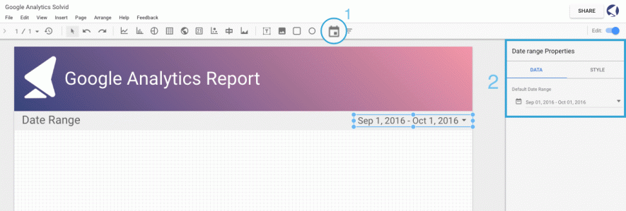
When the report is shared, your clients and colleagues will be able to select a custom date range and see the data according to the date selected.
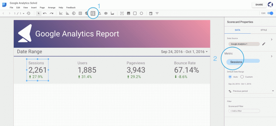
Step 11: Let’s now add some scorecards to illustrate the data on sessions, users, page views and bounce rate. Click on the “Scorecard” and select the area where you want it to appear. Then, in the right sidebar, select the metric to use for this specific scorecard and choose your preferred styling. Repeat this action for every individual scorecard.
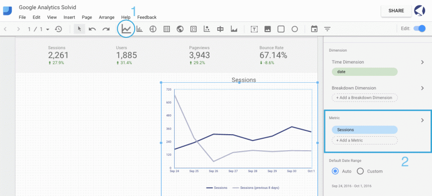
Step 12: Next, we are going to add a line graph representing the website’s sessions. Use the “Line-series” function to draw a graph, and then select a metric to use. In this example, we’re going to use “sessions.”
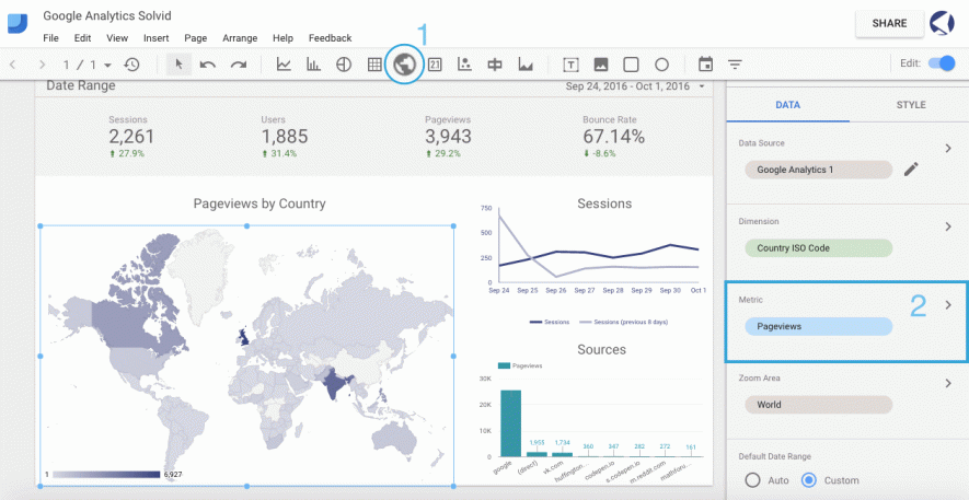
Step 13: Last but not least, let’s add a map of top countries by page views. Just like we did with the line graph, click on “Geo map” tab and select the area where you want the map to appear. Then, select pageviews from the “Metric” section in the right sidebar.
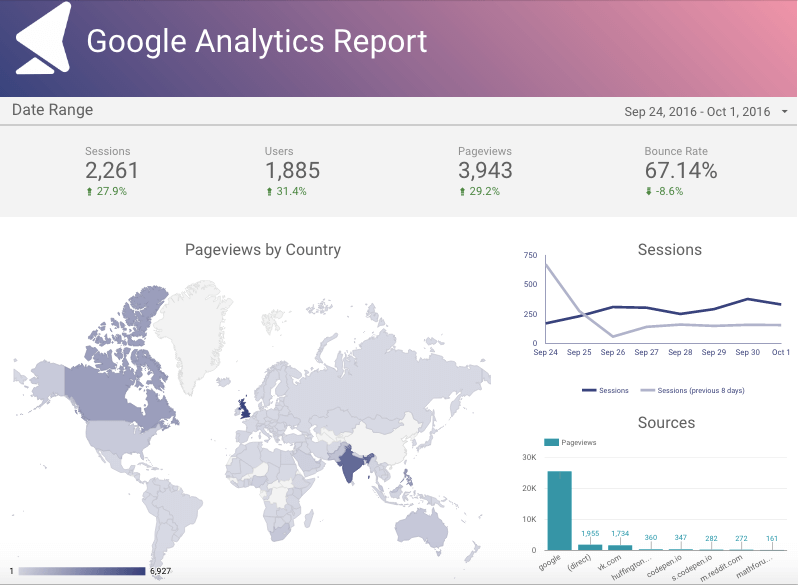
Here is how our final report looks like:
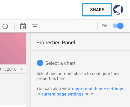
Step 14: Now that we have our report ready, it’s time to share it with our clients and colleagues.
Click on the “Share” button in the upper right-hand corner.
Get a sharable link and/or enter the email address of a person you wish to send this report to.
Are you using Google Data Studio? Share your thoughts below with your best tips!