In November, we unveiled a new MailChimp account dashboard that brings more data to the surface, making it easier to view a snapshot of your marketing performance, identify trends, and track your progress over time. Today, we’re excited to introduce the completely redesigned MailChimp Mobile, a faster and more convenient way to access your data when you’re on the go. Now your e-commerce performance, audience growth, and campaign engagement can be seen at a glance right when you open the MailChimp Mobile app, which is available for iOS and Android devices. Let’s take a closer look at what’s new.
Keeping tabs
The MailChimp Mobile dashboard consists of a series of tabs to help you quickly navigate the app and find exactly what you’re looking for. Much like its desktop counterpart, the mobile dashboard has Overviewand Activitytabs to organize your metrics into single views, making it easy to switch from a summary of list activity with Chimp Chatter to a glimpse of the account’s overall performance. We’ve also included an Explore tab full of feature recommendations tailored to your account usage, educational tips to help you get more out of MailChimp, and the latest MailChimp news and updates so you’re always in the loop.
Spot trends at a glance
The Overview tab is a map of your account’s most relevant data, divided into 3 cards—E-Commerce, Audience, and Campaign engagement. Each metric has its own graph that displays your performance over the past week, month, or year. So you could, for example, choose to see how much revenue was generated from your MailChimp campaigns over the course of a year in the E-Commerce card or view how your list has changed in the past 7 days in the Audience card.
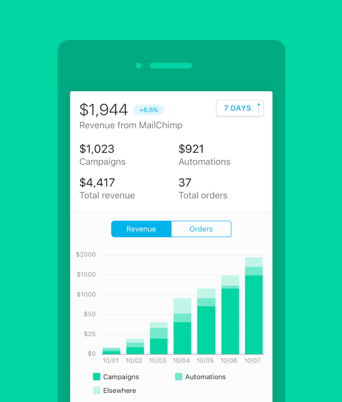
Charting e-commerce activity
If you’ve connected a store to MailChimp, the revenue generated from your campaigns can be found on the E-Commerce card. There, you’ll see a breakdown of your revenue data by campaigns and automation workflows, along with the total revenue data for your store (including revenue generated by non-MailChimp sources). We’ve also included a bar chart and line graph to help you visualize the data.
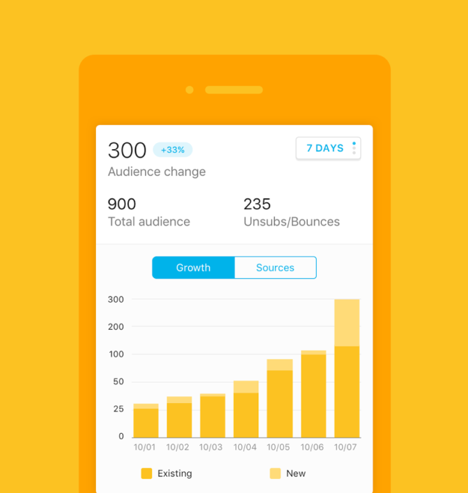
Track the growth of your audience
In the Audience card, you’ll find data to help you quickly identify and analyze changes in your audience size over time. The Growth chart provides a visual representation of your current subscriber count, so you can compare it to the size of your list over previous timeframes. Then, tap over to the Sources chart to see which signup sources your subscribers are using to join your list. If you find, for example, that only a small percentage of your subscribers have joined your list through a hosted form, you might choose to increase the form’s visibility by sharing it more in the future.
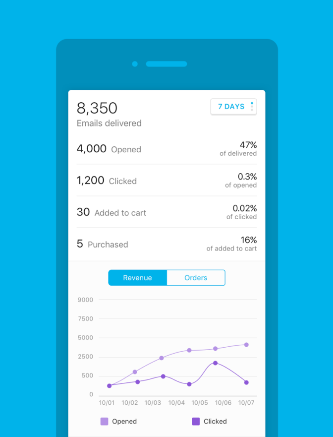
Measure campaign engagement
The MailChimp Mobile dashboard makes it easy to track campaign engagement, too. Whether you’d prefer to measure the success of a campaign through standard open and clicks rates or through e-commerce stats, the Campaign engagement card will help you visualize and compare your performance over time. If you’ve connected your store, the e-commerce graph will display total cart adds and purchases made through your MailChimp campaigns. And, since these rates are based on your previous totals, you’ll be able to judge where you need to focus your efforts in order to increase engagement.
Account stats at your fingertips
With the new mobile dashboard, keeping tabs on your MailChimp account has never been easier. With all of your most important metrics visible at a glance, you can keep up to date even when you’re on the go. We can’t wait to hear what you think, so let us know!