Kevin George The Story of Typography in Email and Why Fallback Fonts Matter … Wow-Score collecting now The Wow-Score shows how engaging a blog post is. It is calculated based on the correlation between users’ active reading time, their scrolling speed and the article’s length. Learn more The Story of Typography in Email and Why Fallback Fonts Matter
- 7
- 5
Email has been in the picture for about four decades and is still one of the most efficient marketing channels, all thanks to the reach that social media lacks. In 2016, a survey jointly conducted by Direct Marketing Association (DMA) and Demand Metric states that Email manages to draw in 122% ROI. But this is not an overnight success; it is due to a combination of trial & errors and the corrections implemented from the takeaways.
Email has far progressed from being a plain text email copy. Ever since emails started supporting HTML coding in 1989, it opened the floodgates and made email visually appealing. Nowadays in addition to email being made visually appealing, email copy is important. But along with what your email copy conveys, it is equally important to check which emotions do the colors and the typeface or fonts, a part of typography in emails, used are passing on.

Different Fonts and The Emotions Conveyed
Take a look at the image below:

In the above example, the same sentence has been written in 5 different fonts, but the tone of the message conveyed changes drastically with the font type.
Serif Typefaces such as Times New Roman, Baskerville, Georgia have little flourishes and swirls at the end of each character. While reading a text of this typeface, eyes have an easy path while sifting through the characters. But the readability gets reduced at font size smaller than 12px. So this is widely used as a headline for major newspapers and so gives an authoritative tone to the text
Sans Serif Typefaces such as Helvetica, Arial, and Calibri don’t have the flourishes as in serif and doesn’t have the issue of readability at smaller font size. So this is widely used for both headlines and body text in most web and digital content.
Handwriting Fonts such as Lucida Handwriting and Pristina are inspired from the cursive handwriting from the letters of the past. This is used to hit the nostalgia feels and also give a personal touch when used in type.
The next kind of font used on the web is called Decorative Fonts. Such typefaces are not extensively used in the text but mostly used in logos and short bursts of text. As in the above example, Comics Sans, as the name states, was the font used in comic books and so gives a casual humor tone to it. The stencil was used mostly in military institutes and has an authoritative tone to it.
Now that you are acquainted with the different fonts used let’s move forward to how fonts are used in emails.
Rendering the Font in Email
How email clients render a font is based on the availability of the specific font in the device. If you check the source code of your email, you shall find a code such as:
<td class=”fallback-font” style="font-family: 'Montserrat', Arial, sans-serif;”>Your text here</td>
In the above example, if the font (Montserrat) is not installed in a device, the email client moves on to the next specified option (Arial).
Most of the email designers play it safe by using system fonts, i.e., fonts that are installed on your device by default. No matter what happens, these fonts shall surely render on any device.
But how many subscribers can see your emails in custom fonts?

This means almost 60% of most widely used email clients support custom fonts.
That’s great news!!!
Choosing the Correct Fonts for Your Emails
Email developers, while choosing the custom fonts for their emails, follow certain best practices.
1 – Choosing Tour Fallback Font First
Every character has an x-height and has a space between two characters for differentiating (called Kerning). This plays a great role in the characters accommodated per line. So, it is necessary that your fallback font doesn’t occupy more space than your primary font.
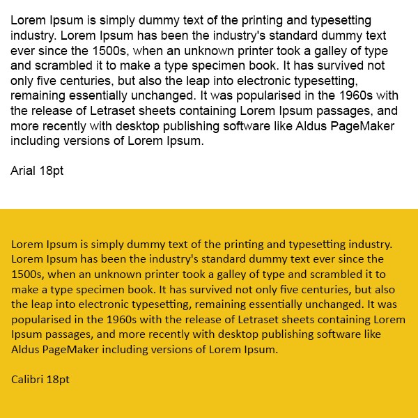
As you can see in the above example, the text in Arial takes 9 lines whereas the same text in Calibri takes 8 lines.
It is important to select your fallback font and then choose your primary font based on the fallback font rather than vice versa. This is because there are innumerable fonts and typefaces available globally and getting their fallback font which won’t alter the layout in any way is very difficult.
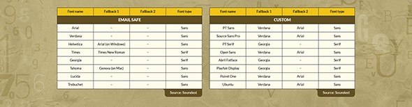
Listed below are the different fallback options for most widely used email fonts:
2 – Visual Hierarchy Using Emphasis
Once you have selected your font, you can still draw the attention of your subscribers to certain parts of your email by emphasizing your text accordingly.
Emphasis can be achieved by:
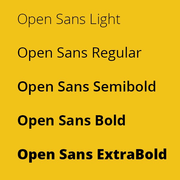
- Font-face: Many fonts have more than one typeface such as Light, Narrow, Regular, Semibold, Bold, and Black.
- Italics and Underline: Even though underline is only used to differentiate a hyperlink from a plain text, italics, and underlines can be used to draw attention.
-
Text Alignment: In the case of long paragraphs, a left-aligned text is generally preferred. Whereas for short bursts, center alignment seems to be the best option.
-
Font Color: Sometimes even before you read a text, the bright font color will make you jump onto a specific line as soon as you see it, doesn’t it? That’s the effect of contrasting font color over a plain background, and this is used extensively by many brands.
Outlook Has Gone Rogue
Outlook doesn’t like to play fair. In case the primary font is not available, Outlook shall use Times New Roman instead of the fallback font specified. So we need to ‘force’ the fallback font using the following VML code.
<!–[if mso]>
<style type="text/css">
body, table, td {font-family: Arial, Helvetica, sans-serif !important;}
</style>
<![endif]–>
Wrapping up
Fonts, Colors, Text alignment together are like the cement that holds the bricks (words) aesthetically and makes the message impactful with emotions. Have you experimented with different fonts in email? Share your experience in the comments below.