Matt Orlic Kill E-Commerce Conversions with These 7 Mistakes Matt Orlic 48 12 2 7 48 12 2 7
UX mistakes come in all shapes and sizes, and even a seemingly normal design element could be a glaring issue to a customer on your site. I’m sure you can recall a time that you were browsing for a local store on your phone and wished there was a click to call integration. Or, encountered an “add to cart” button that was so small you could barely tap it with your finger.
Problems like those are still common today, and they’re having a pretty severe impact on conversions – especially on mobile devices. On average, there’s a near 50% drop in add-to-cart activity from desktop (8%) to mobile (4.8%).
If you want to keep conversions and gain that revenue, you need to take a close look at the user experience (UX) on your site to ensure you’re not inadvertently killing your conversions. Here are 7 of the most common UX mistakes you might be making.
1. Not Designing for the Customer
Business owners usually have an idea of how they want their site to look based on personal preference and how they want to portray their brand and products. If you use an e-commerce platform like Shopify or BigCommerce then you’ve likely taken the same approach in choosing a theme.
At the end of the day, it doesn’t matter what looks good to you. The design of your site should serve the end user, and it should be designed in a way that helps deliver a message and get the user – as easily as possible – to the checkout.
The best way to make sure you’re designing for your customer is to do UX testing with an unbiased 3rd party. Check your analytics to see how visitors flow through your site and where they drop off. That insight can help identify where friction is being generated.
2. Creativity Doesn’t Win Conversions
Finding the content or products customers need is not supposed to be a treasure hunt.
Don’t try to win creative awards. Your goal is to sell a product, nothing more. The vast majority of your customers aren’t suddenly going to purchase from you because they think your site was designed by a creative genius. Make sure their expectations match the outcome of an action on your site.
When you set up user testing on your site, have your desired funnel clearly defined. Measure how the flow of testers compares to your desired funnel, and fix what is forcing them to deviate.
3. Trying to Force an Unnecessary Action

If you want your customers to purchase product A, don’t splash the page with popups, opt-ins and force them to create an account. This only creates barriers that prevent your customer from taking the desired action.
You can reduce these barriers by saving pop-ups for exit intent, and allowing for guest checkouts. Forcing a customer to create an account is one of the top causes of shopping cart abandonment and it will ruin your conversion rates.
4. Innovation without Cause
We’ve gotten pretty good at web design over the last 20+ years. In that time, design and marketing agencies have performed countless analytical studies to determine the best way to layout websites for maximum engagement and conversion.
So it makes little sense to try to change traditional, proven site layouts just because you want to be innovative. Customers are used to elements like checkout and cart functions being in the top right, “add to cart” buttons under descriptions, filters on the left, etc.
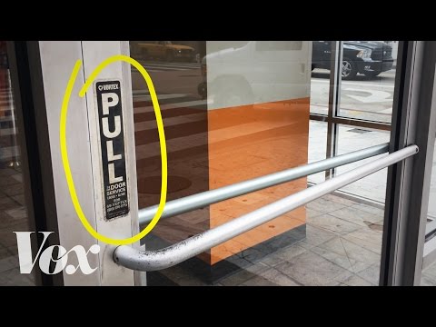
If you deviate, your reasoning should be backed by data showing that your design approach is functionally sound and won’t hurt conversions. If you have to explain functionality or provide direction then you’re square in the middle of the Norman Door principle of bad design.
5. Ignoring Mobile
There are still too many online businesses who don’t take the time to ensure site functionality is clean for mobile users.
Case in point, a recent client was having conversion issues (below 2%.) His analytics revealed more than 80% of his audience were on mobile.
When I loaded his site on my phone, the screen was occupied by an opt-in (at the top) and a notification app at the bottom. Those pop-ups completely blocked navigation, making it impossible to do anything except click the featured products on the home page. A few tweaks to how those popups displayed on mobile lifted his conversions to almost 9%.
Mobile traffic behaves different, and those shoppers need to be strongly considered when you design your site. They likely make up a good portion of your traffic, and that’s only going to continue to increase.
6. Not Prioritizing Performance
It might surprise you, but a delay of just one second in page load time can drop your conversion rates by as much as 7%. If your conversions are already low, that’s a significant hit to your revenue and you’ll be lucky to see any sales at all.
Not to mention load speed impacts your search rank.
Creative designs, beautiful images or illustrations might be aesthetically pleasing, but they can dramatically impact load times. Consumers are impatient, and when they’re looking for a specific product or solution they’ll be quick to bounce back to search results and try another store if your site hangs for more than a couple seconds.
Don’t forget to check load times between desktop and mobile. Broadband is considerably faster than mobile networks, yet mobile users expect pages to load just as fast, and those users are just as quick to leave a site if load times take too long.
7. Complex Checkout Processes
It amazes me when I still see ecommerce sites that make users go through dozens of clicks in order to get a single product to the cart. While I never recommend copying competitors, this is one area where you need to take a cue from sites like Amazon and it’s 1-click checkout.
Ideally, the customer should be able to reach and complete the checkout process in 3 clicks or less. That should look something like:
· Clicking to the product they want (or clicking “add to cart” if they land on a product page
· Clicking the checkout button
· Filling in their information to checkout
· Clicking the “submit” button to complete the process
While studies have shown the “3 clicks or less” rule doesn’t necessarily make customer happier, adding too many clicks has a higher probability of creating friction in the buying process. The safest approach is to minimize action to reach a desired result.
Conclusion
It’s not likely that all of these issues would be plaguing your site, but if you’re looking for ways to improve conversions these should be some of the first items you check to ensure that your UX isn’t crippling conversions.
As always, any changes you make to your design and experience should always be verified with split testing or user testing.
What tools do you currently use to A/B test designs? Please share any examples of when you have improved your call-to-action conversion.